
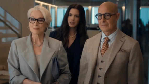
Meryl Streep, Anne Hathaway, Stanley Tucci in The Devil Wears Prada 2 (Dir David Frankel, 2026)
“Netflix lighting” is online shorthand used by critical audiences to explain the phenomena of modern media all taking an identical stylistic appearance. Though referred to as “Netflix” lighting, the term is used often in reference to any piece of contemporary media that dons a blown-out, de-saturated and ultimately colourless appearance due to choices made in lighting, production design and colour grading.
The issue with “Netflix lighting” is not just its subjectively unappealing visuals; the criticisms audiences often have is the lack of originality, style, and the loss of magic in cinema that audiences have grown to love.
The technical explanation for the visual sameness boils down to studios lighting for the fast turnover times of streaming productions. As discussed by the Sydney Morning Herald, there are a plethora of logistical explanations to this phenomenon, including the quality of common LED displays and the modern transition from tungsten to LED lighting techniques. When units are working across projects and production turn-around times get faster and faster, the safest bet is to avoid error by minimising effort. Shadows cost money, while contrast and depth looks better, eliminating them and opting for soft, dull lighting in place avoids extra time spent on continuity, allows colourists more room to add texture in post, and cuts back on set up times during shooting.
Streaming service originals “look like that” because producers no longer care about the visual quality of their work, partially because it is cheaper to do so, and partially because they believe their audiences are oblivious to the change. Described by Jordan Aldredge for NoFilmSchool, the transition has been a long time coming, being slowly phased in over the past decade of content development and not sprung onto audiences out of nowhere. This means that while many audiences have become aware and opposed to the hegemonic visual style of content, for many of us it has been happening under our noses for years without any real attention brought to it. the problem now has become the monkey see, monkey do of it all. When streaming services change their visual style to accommodate for fast paced production turnarounds and double-booked crew, other studios recognise their success and copy the technique, believing that the repeated choice to lose depth, shadow and colour is an audience preference.
Netflix Lighting In Practice:
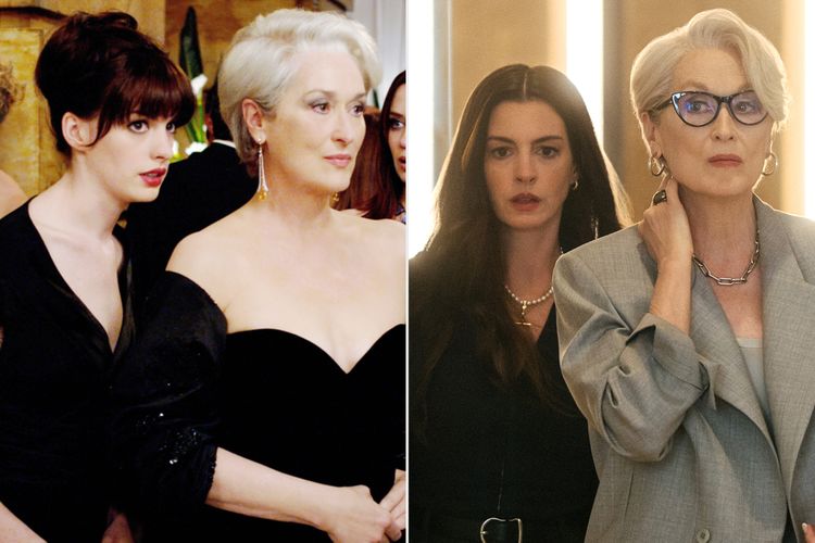
The Devil Wears Prada 2006 pictured next too The Devil Wears Prada 2 2026 ( Via People.com https://people.com/the-devil-wears-prada-cast-original-film-vs-sequel-11958598)
This phenomenon can be seen plaguing many recent box-office releases, often time best exasperated by the sequel or reboot releases when audiences can point clearly to the visual difference to the originals, For example, the Devil Wears Prada 2 (Dir. David Frankel, 2026). The beloved original 2006 film has maintained a cult audience for the two decades since its release, regarded for its wit and style the film bares a visual tone that matches its subject matter to amplify the cinematic experience. In contrast, its 2026 counterpart is victim to the “Netflix lighting” curse, with all the colour and contrast of the original replaced with greys and whites. In a movie about fashion, it is sensible that the visual style changes between the two-decade gap in releases. Fashion in the mid 2006s was bold, patterned, bright, while in 2026 the runway and streets both boast neutrals and de-saturated palates. The 2026 film itself is about protagonist Andy trying to re-vamp a dying industry and re-ignite the passion of her peers. Stripped of the colour and style of the original, the executive choice to use “Netflix lighting” in the 2026 sequel ultimately ruins the cinematic experience by juxtaposing the themes of the film itself with the visual style.
“The devil is in the details. And the details do not impess”
Christopher llewellyn reed for film festival today
“Netflix Lighting” has become synonymous with high budget or “expensive” looking films. In reality, its cost is far cheaper than its independent, colourful counterparts. The good news of the matter is that fatigue of this specific cinematic look is becoming obvious in audiences, with increasing numbers pointing it out online and refusing to watch films that suffer from the dulled down look. This, in hope, will invite newfound creativity and success from independent and smaller budget film makers who deny using the short-cut technique.
 IAmAWeirdLittleKnickKnack
  denneyl
  Toffee Kit